Creating a Form |  |
Forms are the best way to communicate with your clients, they are accessible any time of the day and a record of correspondence can be held in the system if you so choose. There is a similar mantra to the Image creation with forms.
1. Create
2. Publish
3. Insert
The website administration is made up of several different areas. There is the main area of the Administration Tree which we have stepped through previously in this manual. Then there is a whole realm of other administration areas which make your website work and enhance it’s capacity. Think of these other administration areas as your Database Content Management (DCM). For this section we are going to talk about the Form Builder within the DCM
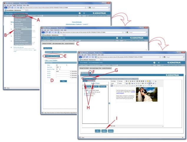
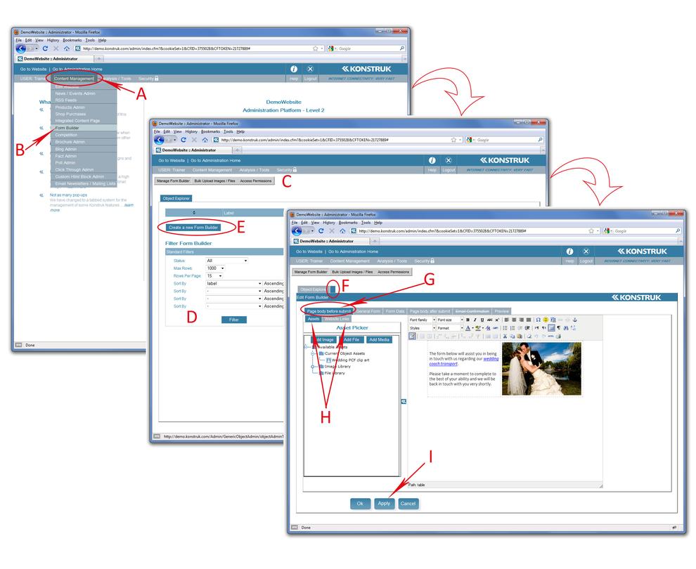
- Access to the DCM is done via the Content Management link in the grey menu bar at the top of your console
- Select Form Builder
- You will be taken to the Form Builder DCM - the top grey bar is main navigation - you will generally only use the first option “Manage Form Builder”. “Bulk Upload Image / Files” is if you wish to upload multiple image or files to the Form Builder Library and “Access Permissions” is if you wish to stop other administrators from accessing the form area. Please speak to your developer if you require more information about the last two.
- When you have a lot of forms in the Form Builder DCM you can quickly find or sort your forms by using this sorting area.
- Click on “Create a new Form Builder” to start
- You will see a new tab open up next to the Object Explorer. The Object Explorer is the ‘home’ of the form builder, you can open as many forms along this tabbed bar as you want.
- WARNING/ When you click to another area of the DCM i.e. Bulk uploads, you will automatically close all forms that are open along this tabbed bar
- The first tab within your new form is the “Page body before submit” whatever you type in here will show about the form when you insert it into a new folder and page via the Administration Tree. You may prefer to leave this tab blank and put the information into the Administration Tree Page for ease of access.
- Within the “Page body before submit” are two additional tabs, for uploading an image and linking to other areas of your website. The process is the same as inserting links on page 17 and inserting images on page 23.
- Apply between each tab of your form to save any changes you have made to date.
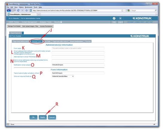
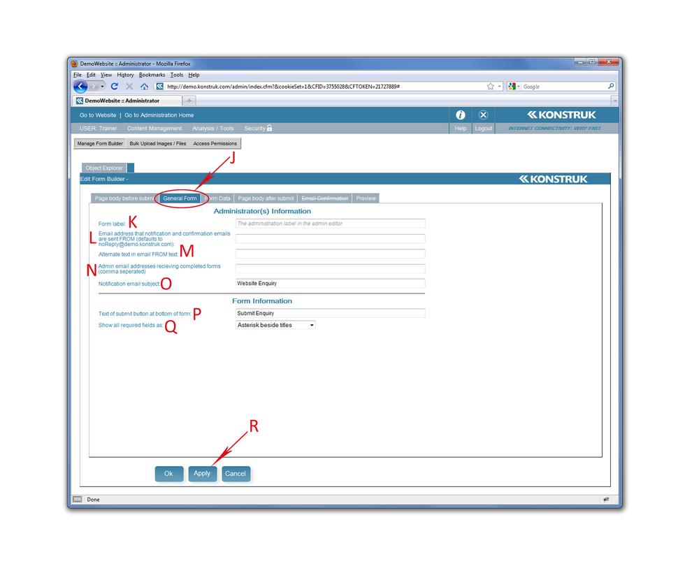
- General Form tab - this is where you will advise each and every individual form who you wish to receive the email when a form has been completed via your website by an end user. And some base form information.
- Form Label - Not displayed anywhere - it is simply the name of the form in your Form Builder DCM
- Every form needs to be told who is sending the form. The form gets sent from your website to the person inside your company receiving the completed form AND to the end user that has filled in the form. It is recommended that you purchase another email address that is used for all forms, e.g. forms@abc.co.nz and use this in this field
- The same as you may have done in Outlook you can place a name in front of the “L”, the email address from, to give your email some identity. e.g. ABC Website Administration. This will show as ABC Website Administration (forms@abc.co.nz). If you do not want people to reply to any emails they receive after submitting a form it is recommended that you type in NO REPLY to this field.
- Who within your company will be receiving the completed forms? Put their email address in here. You can have more than one, just separate them with a comma.
- This is the subject of the email that is sent to the person in your company receiving the completed form by an end user. If you have multiple forms, it is a good idea to identify each form differently. e.g. Website Enquiry | Sales; Website Enquiry | Product Request; Website Enquiry | Competition etc.
- Relating directly to the form displayed on your website, enter what you wish the button at the end of your form to say. e.g. SEND FORM; ENTER NOW; SUBMIT ENQUIRY etc.
- Fields that are required - how would you like them identified to the end user. Most common is the Asterisk.
- Apply between each tab of your form to save any changes you have made to date.
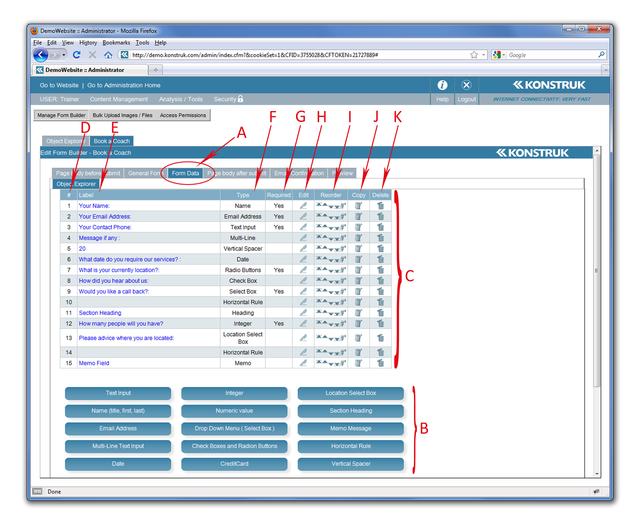
- The Form Data tab is where you create all the fields that the end user will complete.
- At the base of this tab are all the buttons that you can input into your form
- When you have selected a button and completed the necessary information the will display above the buttons
- The row number and order of your form data fields
- The name or question that you have called or asked the end user will be displayed here
- The type of this form data field
- Have you asked the form data field to be a ‘required’ entry by the end user, i.e. it will show with an asterisks beside it
- You can edit each individual form data field by clicking on the pen once created. You may also select the label words to edit each form data field too
- This is how you control the order of each form data field
- You can copy a form data field if you so desire. This is handy if you have a large check box form data field for instance
- You can delete each form data field
Most of the form data fields (B) are very self explanatory, however there are a couple that we will provide a description on.
Text Input - free text fields for the end user. It is a good idea to use this for a phone number instead of a numeric value as it allows for spaces and notes and symbols or glyph e.g. +64 3 333 1234 - during business hours only please
Name - this will give the end user 3 input fields, Title, First Name, Last Name. If you do not wish that, then use a Text Input field.
Email Address - The email address form data field will recognise if it is the correct format for an email, but not if it is a valid email address. If you select the “Send an email confirmation upon form completion to the client at this email address” tick box, then you will need to complete the ‘Email Confirmation’ tab. This is where the end user will receive an email after they have hit ‘submit’ button on the form. You may choose not to tick the box and thus not complete the ‘Email Confirmation’ tab as you are happy with them receiving notification of receipt via the physical website, which is completed via the ‘ Page body after submit’ tab.
Integer - the system will reject anything that is not a full number, positive or negative. i.e. it will accept: 553 or -553, but it will not accept 553.99
Numeric Value - any form of number - possible or negative
Vertical Spacer - if you need a larger gap between form data fields you can choose your value and insert it
Horizontal Rule - predefined by your developer and will place a divider between the form data fields.
Credit Card - You must obtain a HTTPS URL for this to work, it is a secure web address that protects your end user - speak to your developer for more information
Memo Message - will take you to a standard content editor window. Handy if you need to place an image in your form.
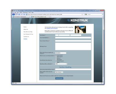
| This is how the example we have created will display on your website. Your developer would have set the background colors for your site and the styles that you have requested for section headings, dividers (horizontal rules) etc. If not then you will need to refer back to them. |
These are some of the form data fields that require a little more explanation.
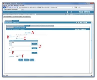
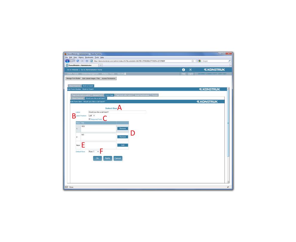
- The Select Box or drop down menu - this will show your label (question) and then a drop down box full of the options that you create in D and E
- Would you like the label to be on the left or top of your drop down box. Most common is left.
- This is the order that your typed in answers will appear in the drop down box. Unfortunately you are unable to reorder, you can remove and re-add or ensure you have it right when you start.
- Type in a drop down option here and then select Add
- Default Row - if you want the option that is shown to the end use to be one of your rows, then select the row you wish it to say. You may consider adding in something like ‘- please select one -’ if you don’t like ‘- none -’.
- Check Box - uses if you wish to have all your options visible on the page with either a radio button option or a check box option
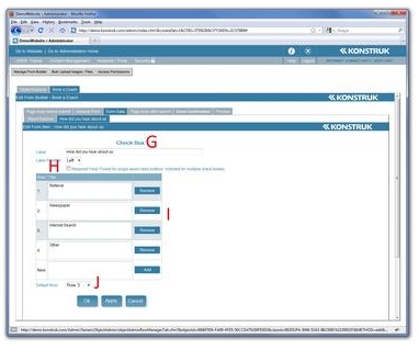
- The required box is what dictates if you have radio box or check box options.
- Radio Box - these are the little round buttons restricting the end user to choose only one of your added options
- Check Box - this allows the end user to select as many as they want of the options you choose via a tick box to the side
- This is the order that your typed in answers will appear in the drop down box. Unfortunately you are unable to reorder, you can remove and re-add or ensure you have it right when you start.
- Type in a drop down option here and then select Add
- Default Row - you would normally only set this option if you are using radio buttons and want to save the end user time by selecting the most commonly used option for them, it does allow them to change.
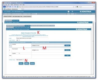
- Admin Recipient Override - this data form field is only useful if you have one form, which has exactly the same questions, but is required to go to a different administrator depending on where the end user selects.
- Example 1/ You have a New Zealand based company but branches in Australia, depending on where the end user is you wish the form to be sent to a different person.
- Example 2/ Your company has many different departs, you can add the different departments and administration recipient emails here, then whichever department the end user chooses it will go to that person only. e.g. Sales; Accounts; Production; etc
- Enter the name you wish the end user to see in their drop down menu. e.g. Australia; New Zealand; Sales; Accounts; Production etc
- Enter the corresponding administration email. This email address is not displayed anywhere on your website. e.g. abc@abc.com.au; abc@abc.co.nz; sales@abc.co.nz; accounts@abc.co.nz; production@abc.co.nz
- Fallback Value - this is similar to a default value, however ... if you are using this option to distinguish for locations then the system is going to automatically look at the IP address of the end user (i.e. which country their computer is telling us they are in) and will use this information to set where form should be sent to, the end user can still override this fall back value. It also acts as a default value, so for departmental use you can set which is the most common department, the same as for Select and Check Boxes.
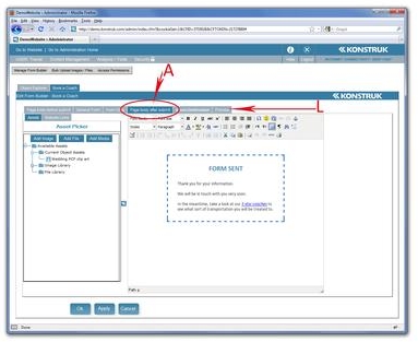

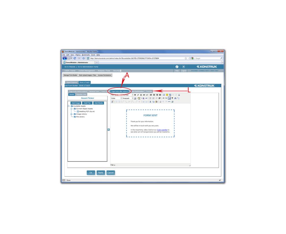
- Page body after submit - This needs to always be completed. It is an indication to the end user that they have actioned their form when hitting the ‘submit’ button. If this is blank then the screen does not change and it could be confusing to the customer. It is a standard editor and you can see any assets that you have already adding to the form.
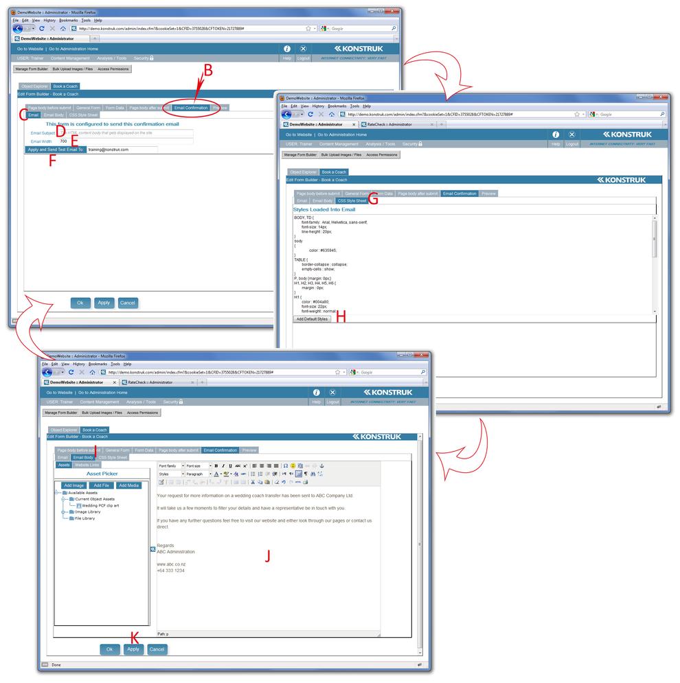
- Email Confirmation - this option becomes available when you have an ‘email address’ form data field and you have selected the “Send an email confirmation upon form completion to the client at this email address”. When the end user hits the submit button they will get both the above (A) and an email directly to them.
- The “Email” tab - this is where you set up the base information of the email to be sent to the end user.
- The email subject is the same as a standard subject line in any email. Complete this with maybe the name of your company followed by a description of the form they have just completed.
- We recommend that you leave this as 700 pixels wide as it is about right for most email applications (i.e. Outlook)
- Ensure that your email address is in the box (this is being picked up from your login Profile) and you can send a test email to yourself once you have completed the Email Body section. This is definitely recommended as HTML and email applications are different and the format could change from what you see in the administration area.
- Skip the middle tab ‘Email Body’ for the moment and head to ‘CSS Style Sheet’. This is what gives you the font, font size and heading tags within your email. The window will be blank when you first enter it.
- Select the “Add Default Styles”. This will drop a heap of code into the window. Generally you should not need to touch any of this window, but it is necessary to make your email look good. It is ok to change a few fields in here, but please be very careful not to delete or alter any of the headings. You could, for instance, alter the font size of the main body text or the Heading Sizes (HTML is in pixels not points).
- Now select the “Email Body” Tab - this is the standard editor.
- You can type your letter / response, upload images, i.e. company logo’s, and make links back to your website if you wish.
- Select Apply to save all changes
- REMEMBER/ you can always return to the Email Tab and select “Apply and Send Test Email To” at any time.
- The Preview tab will show you how your form will look once inserted into the website.
- Form completed. Say ok at the bottom of the page.
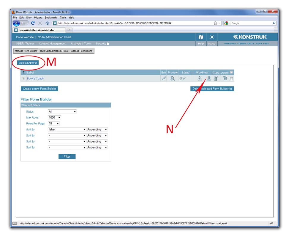
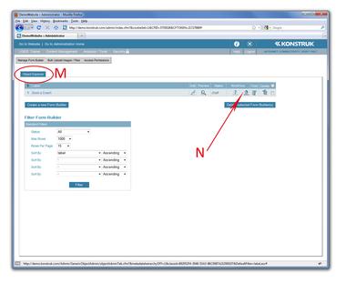
You have now returned to the Object Explorer portion of the Form Builder DCM. This will display all your forms in a database format
- For your form to display on the website you must publish it. Select the www ‘publish’ icon.
- NB/ This is the most commonly forgotten step and will trip you up at the end of the process if it is missed.

